SUBSCRIPTION CHECKOUT FLOW | CONDÉ NAST
Design a scalable checkout system to power conversions across 20+ brands and markets
WIP
Role: Product design Lead
Timeframe: 9 months
Team: 2 People
Condé Nast needed to increase subscription conversions across its global portfolio of brands.
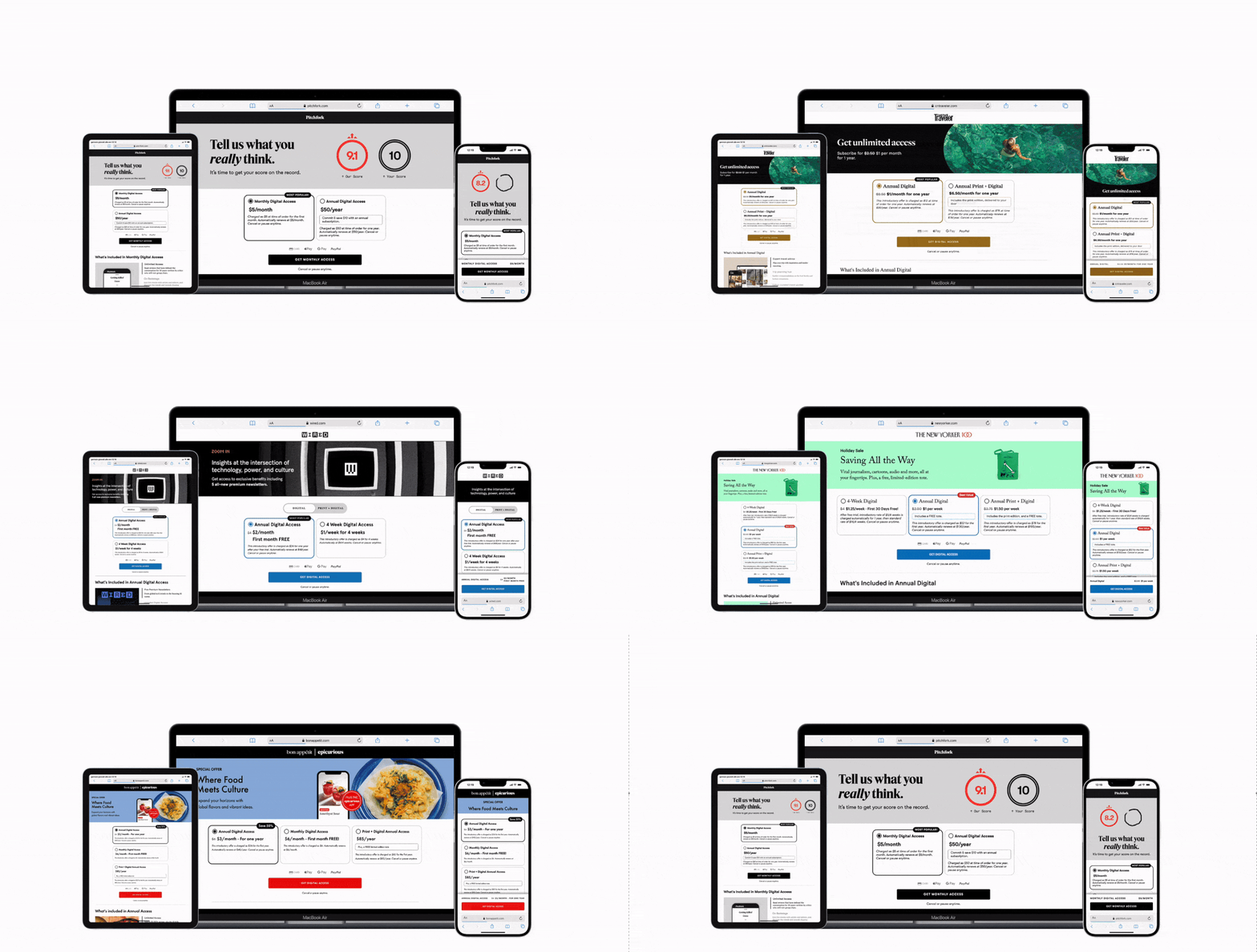
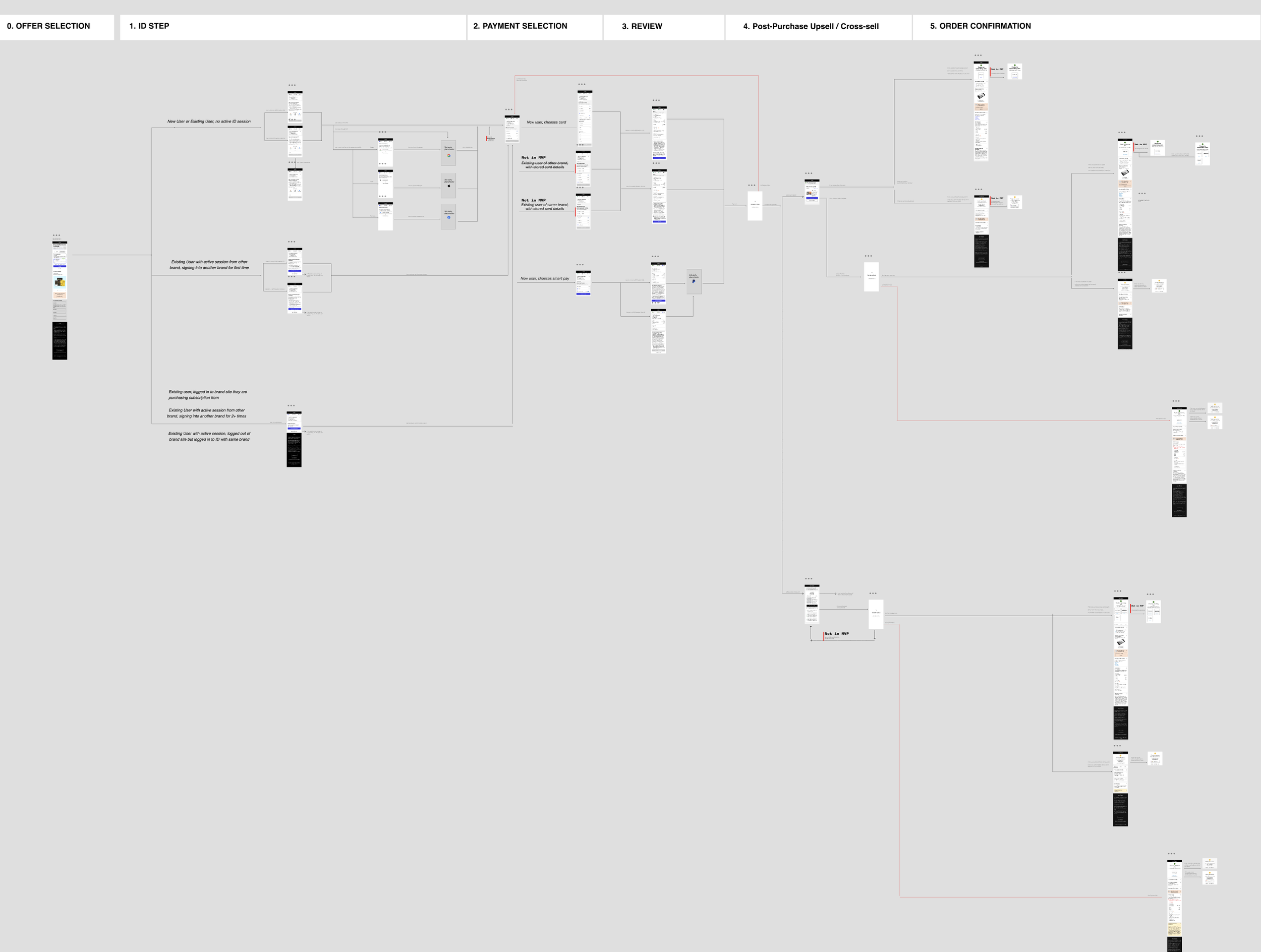
The existing checkout funnel was fragmented and inconsistent. The challenge was to redesign a scalable checkout flow that could be rolled out across brands and markets, while also reducing operational overhead for the business.
THE FOUNDATIONAL SYSTEM BEHIND THE FLOW
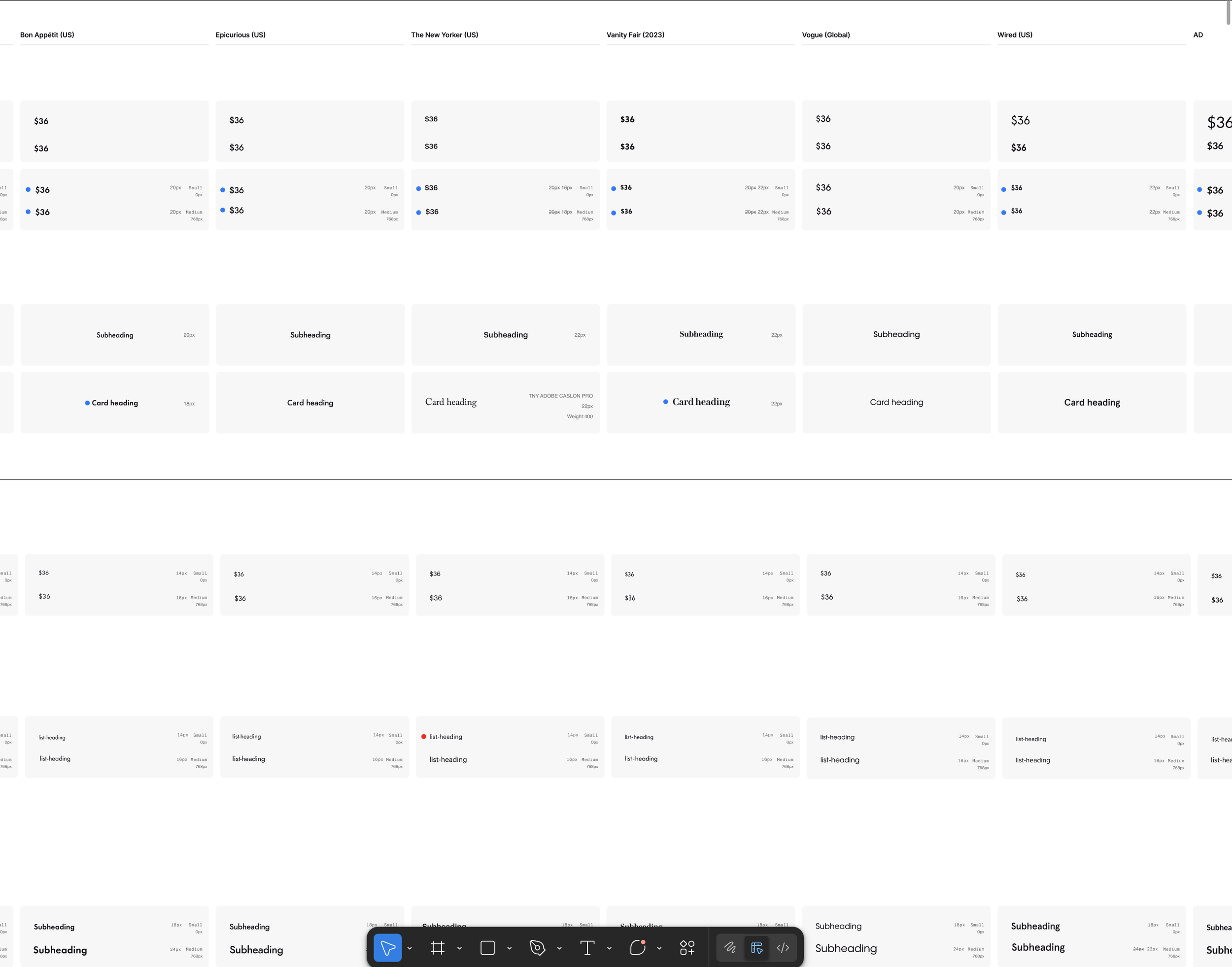
The first design challenge was building a framework that could flex across 20+ brands without fracturing.
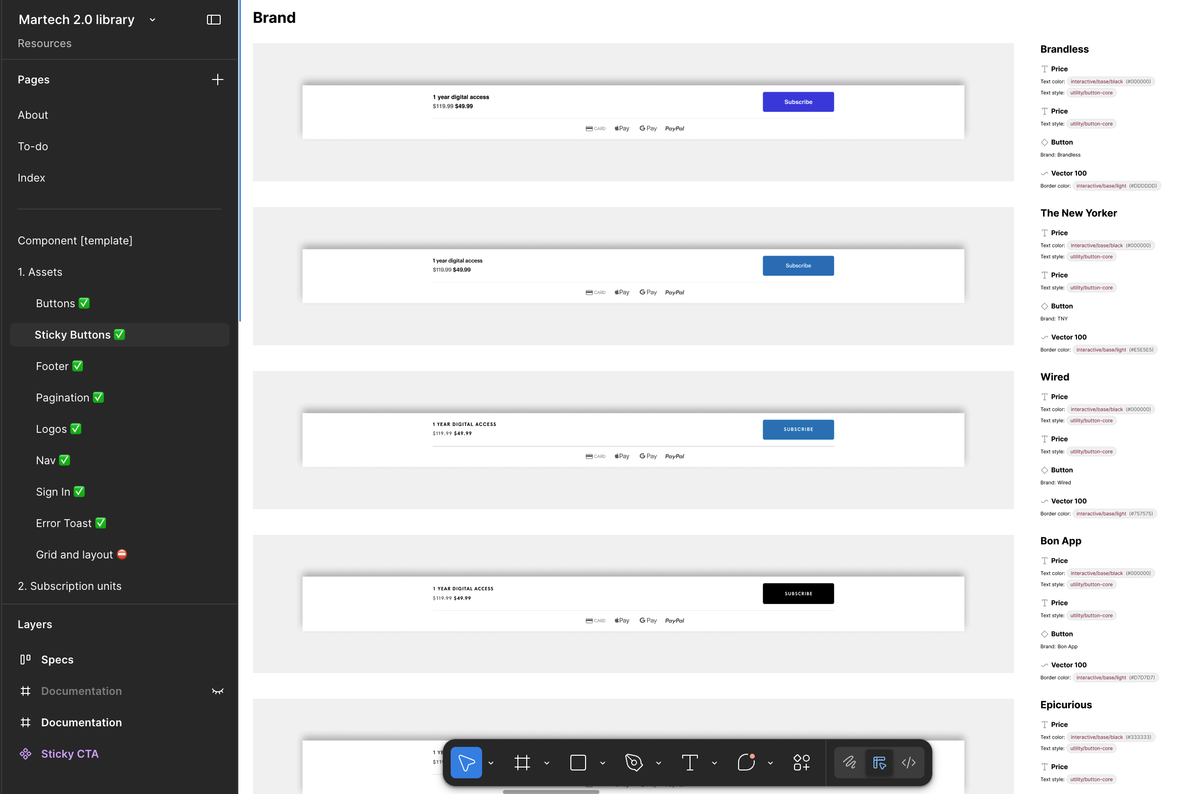
Condé Nast's brands each run on Verso, their editorial design system, with distinct visual identities expressed through design tokens. My job was to craft a utility token set — a transactional design language that sat above the Verso brand layer. The same typographic rigour, the same colour logic, but translated from editorial storytelling into conversion contexts: paywalls, landing pages, payment flows.
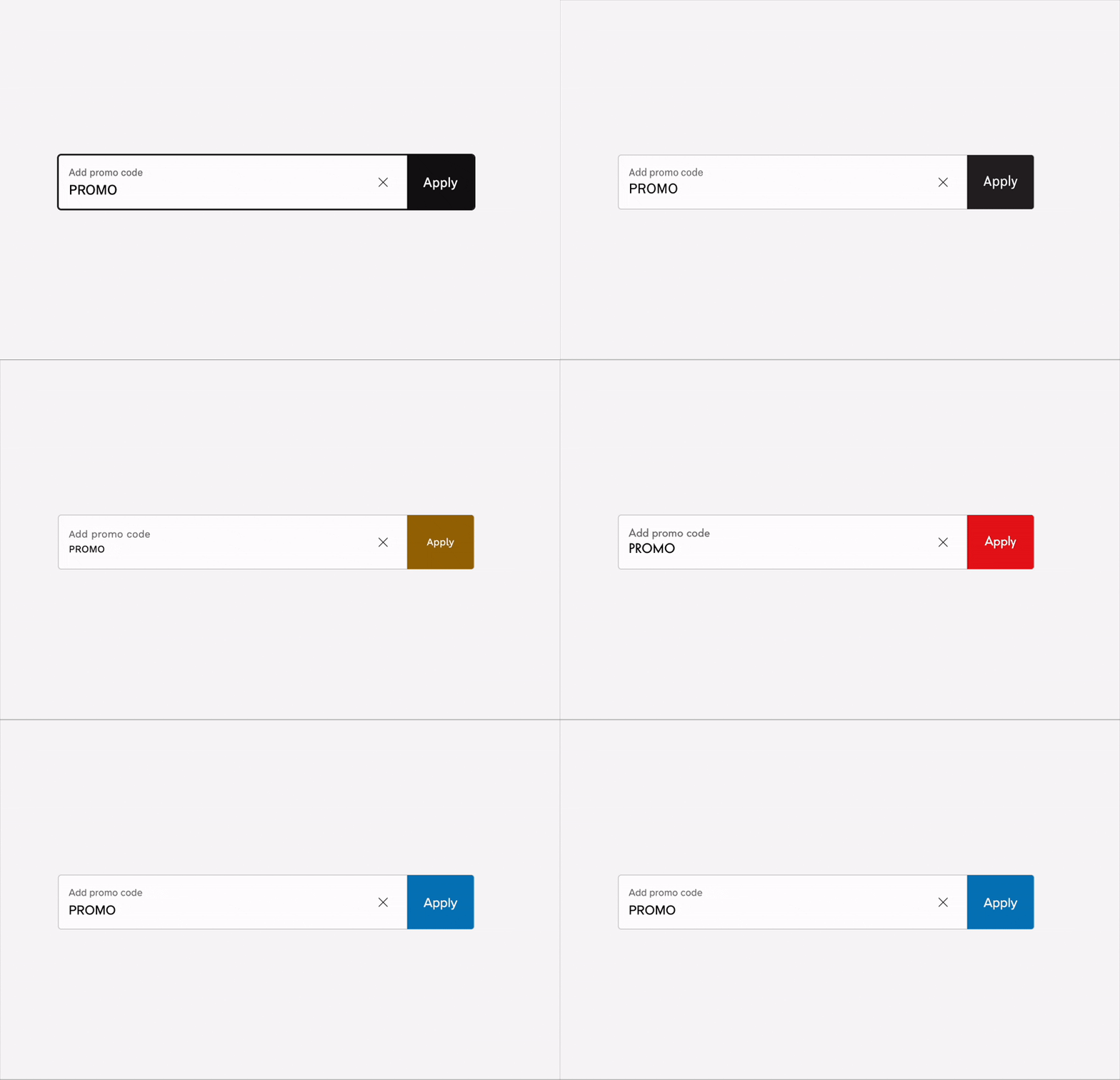
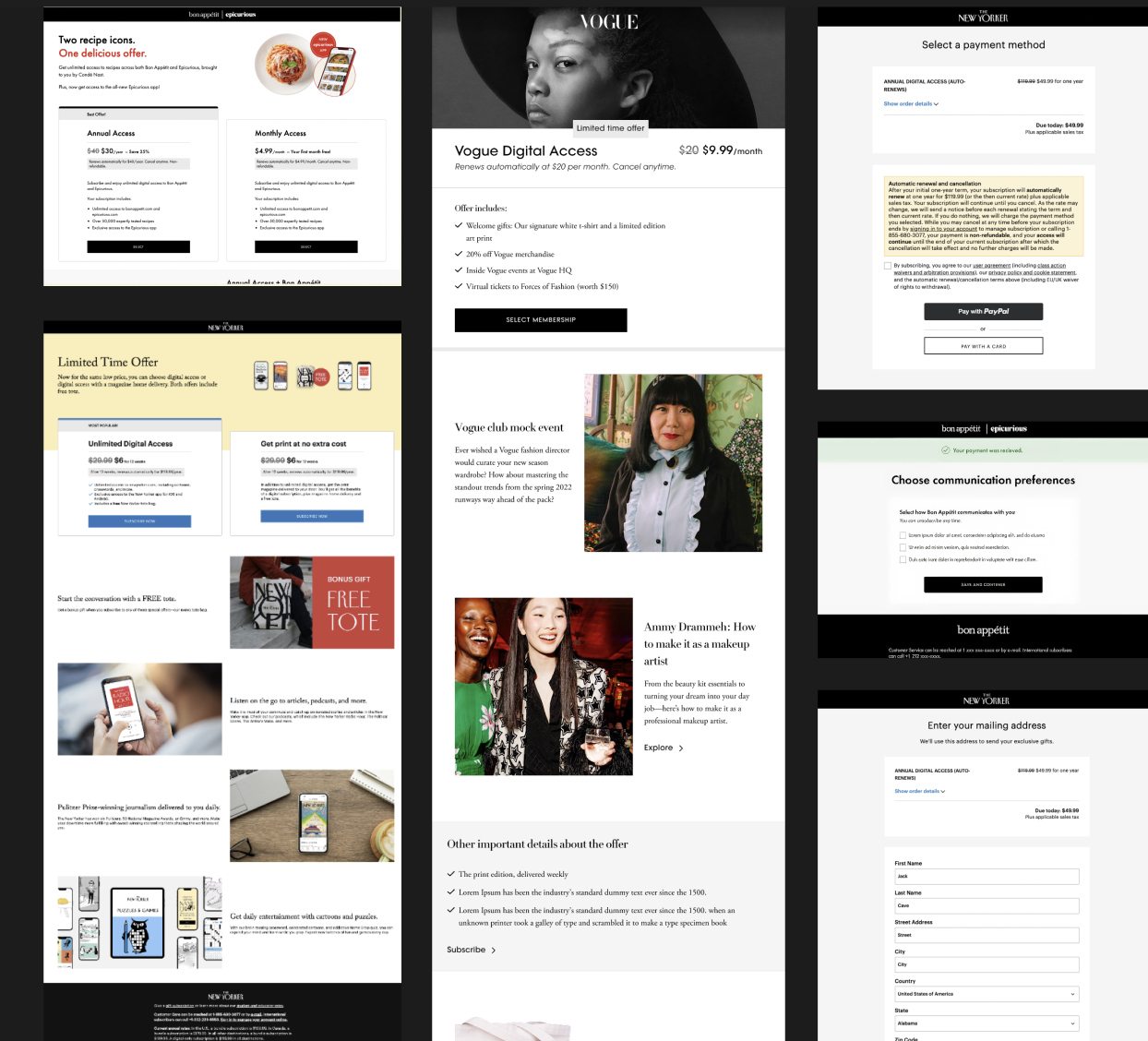
From that token foundation, I built a component library that flexed across three dimensions simultaneously: different subscription plans, different brand identities, and different markets.
Non-technical marketers could configure and launch flows independently without engineering involvement.
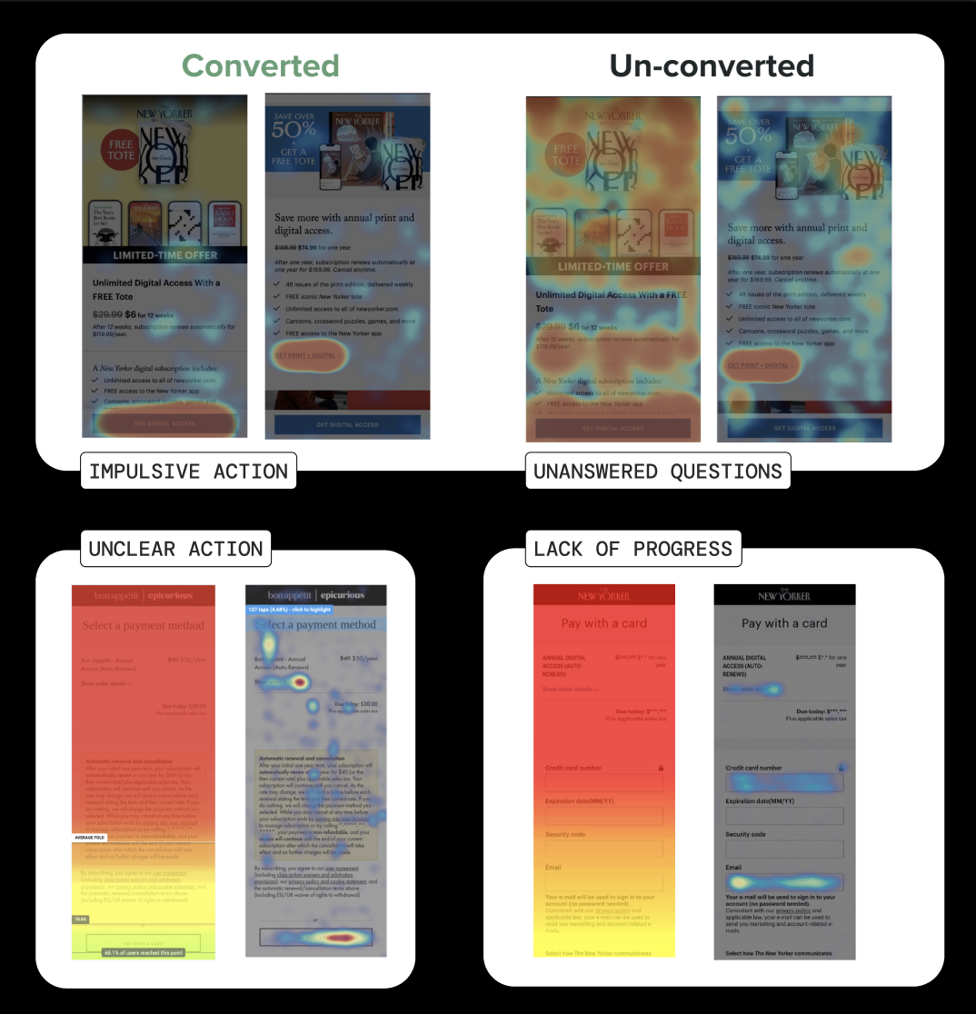
The insight from CX research was direct: subscribers who dropped at payment weren't price-sensitive — they were uncertainty-sensitive. The job was to eliminate doubt, not friction.
I then led a full structural redesign of both the landing page and the payment flow — reorganising information hierarchy, surfacing trust signals at the right moments, simplifying plan comparison, and creating a multi-brand, multi-market framework that legal, finance, and engineering could all work within.
THE BEHAVIOURAL GAP
I’ve helped team members from Product analytics and User research combine their quantitative and qualitative insights, pointing out many gaps in our existing flows:
Repetitive benefits and multiple CTAs were confusing users.
Unanswered questions leading to drop-offs.
Strong friction points, especially in address entry and while reading our Terms and Conditions.
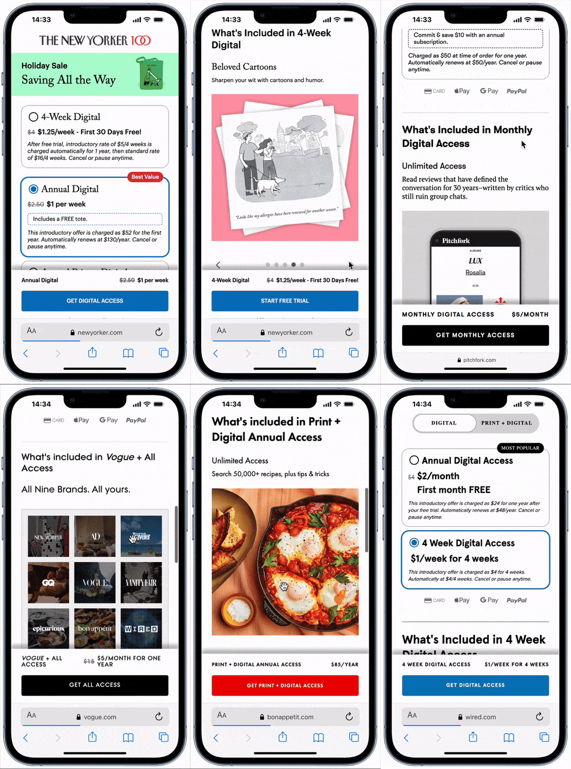

Outcomes
The redesign delivered measurable impact on both user experience and business growth:
Conversion rates: +10% (Vanity Fair), +25% (Vogue), +15% (Wired), +9% (Architectural Digest).
Landing page performance:
+164% visibility of benefits
+8% increase in offer selection rate
+54% higher conversion among users who engaged with FAQs
Operational efficiency: 230+ flows launched across 7 brands with no reported issues.
The New Yorker Landing page was also featured in the Top 5 Landing pages by Landingmetrics.com, with a UX score of 86/87